Wednesday 17 July 2013

FINAL GRADE UNIT 5 & UNIT 27


FINAL GRADE = DIstinction

Great work, you have really tried hard for this well done.


See individual blog posts for all feedback.


FINAL GRADE = Distinction

Well done here Kristie, you have listened to feedback and worked hard.


See individual blog posts for all feedback.


Monday 1 July 2013

Pitch feedback and Justification of ideas

 We presented our animation ideas to our teacher and class members.

Visual effects editing guide

Visual effects editing guide

Our animation was mainly based around a hand and arm movement where different images appear will then appear into the opening and closing hand.
 We firstly had to ensure that when we were flipping our cards that contained a picture of someone who has been helped by the charity we had to make sure that the pictures where put back into the exact position otherwise the animation would look very unprofessional. We also had to make sure that we was taking a right amount of picture with the same amount of pictures in each shot otherwise again it wouldn't flow very well. We used IstopMotion to create this animation. We used this software as it allowed us to put together all the pictures that we took and the software allows us to play it back to see if it worked and was a professional well flowing animation. After this was done i imported the file into Final Cut Express where i would add fades, edit it to a sound track and to add text to the advert.

"Visual effects (commonly shortened to Visual F/X or VFX) are the various processes by which imagery is created and/or manipulated outside the context of a live action shoot. Visual effects involve the integration of live-action footage and generated imagery to create environments which look realistic, but would be dangerous, costly, or simply impossible to capture on film. Visual effects using computer generated imagery has recently become accessible to the Independent filmmaker with the introduction of affordable animation and compositing software."

Camera Test Shots Analysis

Camera Test Shots Analysis

For my camera test shots I decided to set up the camera in which I would be using to film my animation, I also set up lighting in which I would be using to light up my set. The reason in which I did a test shot for this was to make sure that all the positioning of the cameras, set and lighting was all correct and working to a professional standard, ready for us to film our animation.

In the picture above you are able to see the camera in which we would be using to film our animated advert for Teenage Cancer Trust. I set up the camera to the correct position into how it would be set for filming. I also tested the camera with the lighting to see how the picture would finally come out.

Here is a picture of how the camera angle is going to be set up. I tested a variety of different angles of the set to see if the lighting would effect or reflect in the lens, which would mean our images would not be very clear.

Here I decided to test the camera and quality I would get from the images I used. I decided to take a variety of picture to test how clear the pictures I am using in throughout the  animation would be with the layout I have set up.


Here are a variety of shots which we would use and that would appear in my final animation. These shots are close ups of the hand movements which are used through out our animation. We also used an overview shot for our Teenage Cancer Trust title so that it stood out. 


Consideration of camera

Consideration of camera

LONG SHOT
This is called a long shot. A long shot is a shot including objects at a distance. Long shots can be very intriguing and intresting shots. Long shots are used in film to stablish a scene and to also show a character in their surroundings. Long shots are very good to establish a location.

CLOSE UP
A close up shot tightly frames a person or an object. Close ups are used regularly with medium and long shots. Close ups display the most detail, but they do not include the broader scene. Close ups are used in many different ways, they are used as cut away from a more distant shots to show detail, many films use it to show someone's emotion and facial expressions and in some cases to show intricate movements and gestures.

EXTREME CLOSE UP
This is an extreme close up. Extreme close ups are used to convey extreme detail. Films will use an extreme close up to make their films more entertaining and interesting to watch. Many documentaries use these shots like this to go into extreme detail to attract views and audience.

EXTREME LONG SHOT
This is an extreme long shot. An extreme long shot will be taken from as much as a quarter of a mile away and is generally used as a scene setter and to establish a shot. As you can see in my shot to 
establish the scene of the hollywood sign, in some films they might 
used this to open a film. It normally shows an exterior, e.g. the outside of a building, or a landscape, and is often used to show scenes of thrilling action e.g. in a war film or disaster movie. There will be very little detail visible in the shot, as it is meant to give a general impression rather than specific information.

We used a couple of these shots when filming our own animation, we used a close up shot at the beginning and the end of our animation that consisted of the camera zooms in on the Teenage Cancer Trust logo. We decided to use this shot as it   was vital that we made sure the logo looked powerful and stood out, we needed to make sure that it was also very clear to all our viewers. 
We also used a birds eye view angled over view shot to film the rest of our animation. We only used this shot throughout our animation as we were able to show and express the whole movement of the hand opening and closing and the images appearing. The reason we decided not to use a variety of different shots was because we felt that they didn't appeal to the way our animation ran. In our animation we wont be using any camera movements except a close up and a tilted birds eye view of the set, the reason we decided this was because our advert mainly focused on the hand opening and closing and these shots were the only ones which fitted well. 

Lighting task


When creating Wallace and Gromit animations they use artificial lighting called red head to light up the sets. Black screens are also used which allows the light to reflect off creating the shadows in that specific scene. The term red head camera means that there is a red light attached to the top of the camera, when the camera moves across the scene it continues with the same lighting otherwise the scene will be darker in some places and would make the animation look very unprofessional and the lighting wouldn't be continuous throughout the animation and it would also take away the affect.


Ardman use a variety of effect lighting within there scenes, such as a street lamp, they light these scenes with L.E.D's which stands for light emitting diode's, or they use tiny bulbs linked to a transformer. in some scene they use fibre optics or small torch bulbs. These techniques that ardman use are very effective and are very good at lighting small individual places in an animation for example a house or  car head lamp.

When creating our advert animation we used a interfit tungsten 3200 power lamp. 
The reason we chose to use this light was it was an easy and light object to move, the head of the light can be adjusted allowing us to be able to tilt and direct the light in the correct position allowing us to be able to light our set to exactly how we wanted it, the light is very bright meaning it will easily light up our whole set and there would be no need for any other lighting. 
Some possible issues that could arise during a lighting set up could be the light over heating, this can be very dangerous as if someone was to touch the light they could burn themselves. We also need to be careful with leads and cables in case anyone was to trip over and cause any injuries. 

Analysis of movement

Analysis of movement

Near enough all animated adverts will contain a variety of shots. These shots are used to create final animated advert. The different type of shot can determine the mood of your advert for example if an advert consist of a close up shot on someone's face which appears to be unhappy then this would show that the advert is going to fairly sad or emotional rather then if the person was smiling or laughing which would then show the mood of the advert is happy. This shows that you have to make sure you use the correct shot for your advert so that you have the correct mood.


The first shot we used in our animated advert was a close up on the Teenage Cancer Trust logo. The reason we used this shot was to portray and show to the audience that our advert is based around this charity. The close up shot looks a lot more effective at the begginging of our advert rather than having an ariel shot of the logo.


The second shot we used in our advert was a tilted birds eye view of the set. The reason we decided to use this shot was to capture everything going on in our set, and we also wanted to be able to see the whole hand/arm which was holding the images. We also used this shot to make our advert look more professional.


The third shot we used was a bird eyes view close up of a clenched fist. The reason we chose to have this shot was so that we were able to see the movements of the hand moving.

In Stop Motion  there are some standard camera movement terminology and descriptions used In live action cinematography and carried over into videography. When moving a camera when filming an animation you have to physically move the camera while shooting certain scenes, that means every time you move the camera you have to take a picture. Moving the camera is very much an artistic-creative decision. Too much camera movement is a distraction and sometimes used to show-off or impress. Camera movements also applicable to Stop Motion, however the difference is, you will be animating the camera movements frame by frame at the same time the puppets are animated. It doesn't matter what type of camera shot you are doing whether is was  pan or a tilt, every time you move the camera you have to take a picture. 

 PAN- left of right
TILT- up or down
 PEDESTAL- up or down
TRUCK- left or right

Evaluation presentation

Pre Production: Planing

During our planing stages we had a number of things in which we needed to consider. Not only did we have to think about our idea for our advert but also how our advert would fit in with the charities brand standards. We had several meetings during our planning process to discuss our ideas for our final advert, we also spoke about the ways in which we would link this to our charity and the aspirations we wanted this animation advert to have. Our original idea was to start the animation with the logo and to have the logo present through out the animation, the middle part of the animation would consists of having a number of different individual cards that all contained a picture of a teenager that the charity has helped , as the hand moved over the cards the cards would flip over showing the picture, as the hand returns back going in the opposite direction the cards would flip back over. We came to a group decision to scrap this idea as it would be very hard and complicated to make, as the pictures had to be small however the hand was not big enough to cover up the whole diameter of of the card with the picture on meaning this would look very unprofessional for an advert.

We had other meetings to discuss how we could make this work. Our final idea which we came up with was to have the logo at the beginning of the animation, a hand would then slide across to remove the logo.The hand will then appear on screen as a clenched fist, as the hand reaches the middle of the set it slowly opens as it opens an image appears of a teenager this picture changes six times then the fist will close and open again containing another six images this is repeated three times. once all the images have been shown the hand closes and opens with the logo all in separate pieces , the hand then sorts out the pieces to create the logo, the last shot in the advert is a close up on the Teenage Cancer rust logo. We believed that this idea was not only more entertaining but was allot more professional.

Production: How you made it 

Our production for our advert was very effective yet simple. We designed and created our own set, we then chose between the three of us which hand we would use to present our animation. The next step we had was to make sure that all our pictures from the Teenage Cancer Trust were all the same size and cut equally. The hardest part of our production was setting up the camera and lighting, we found this difficult as the angle we wanted was very hard to get the camera in the centre of the set. To help us out we sectioned out a area on the set in which we made a small square where the camera would stand to make it center of the set. Once all the lighting, camera and set was in place we were then able to take the pictures and upload them to final cut ready for the post production of the animation. 

Post Production: Editing 

The editing stage of our animation was the easiest and fun part of creating our advert, due to the fact that we were able to put into place our final animation adding in effects and words to create our final animated advert. Once all the images was to the same length we simply joined all one hundred and twenty seven pictures and added text to the end of the advert. To make the advert more entertaining we also decided to add a sound track that was present through out the whole animation the sound track we chose  Cold Play Fix you, which also fitted in really well with our charity. 

Improve.

If i had the chance to re-do my advert again I would make sure that any paper cut outs would be produced on laminated card to make it look more professional rather then just normal paper. I would also use more hand movements throughout such as every time a new picture would appear the hand would clench first and then re open again to make it look more effective. I would also make sure that a small logo present on screen at the top right hand corner at all times to make my advert look more professional and so that the charity would also be able to always be seen.

Overall I very happy with our final animated advert. 

Wednesday 19 June 2013

Feedback questionnaire


We decided to create a feedback questionnaire in which we would hand out to a variety of people who had seen our final edited version of our animation. We asked seven questions overall which were:
What is your gender?
What is your age?
Did you enjoy watching the advert? Please list your reasons as well.
Do you think it is suitbale for Teenage Cancer Trust? Please list why.
What do you think we could change in our advert?
Do you think our idea is creative for out charity? If yes please list why.
What do you think of our set design for our advert?

|
|
|
|
|
|
|
|
|
|
|
|
|
|
|
|
|
|
|


The majority of our feedback was positive which showed us that our animation for our advert was successful. We did receive some feedback which would help us improve our advert if were able to this again, if we were able to re do our animation we would add in a voice over which would make this more appealing, we were also told that it would be a good idea to re-create the logo with the moving pieces. Overall i am very pleased with the feedback in which we received for our advert for Teenage Cancer Trust.

Annotated Screen Grabs of edit

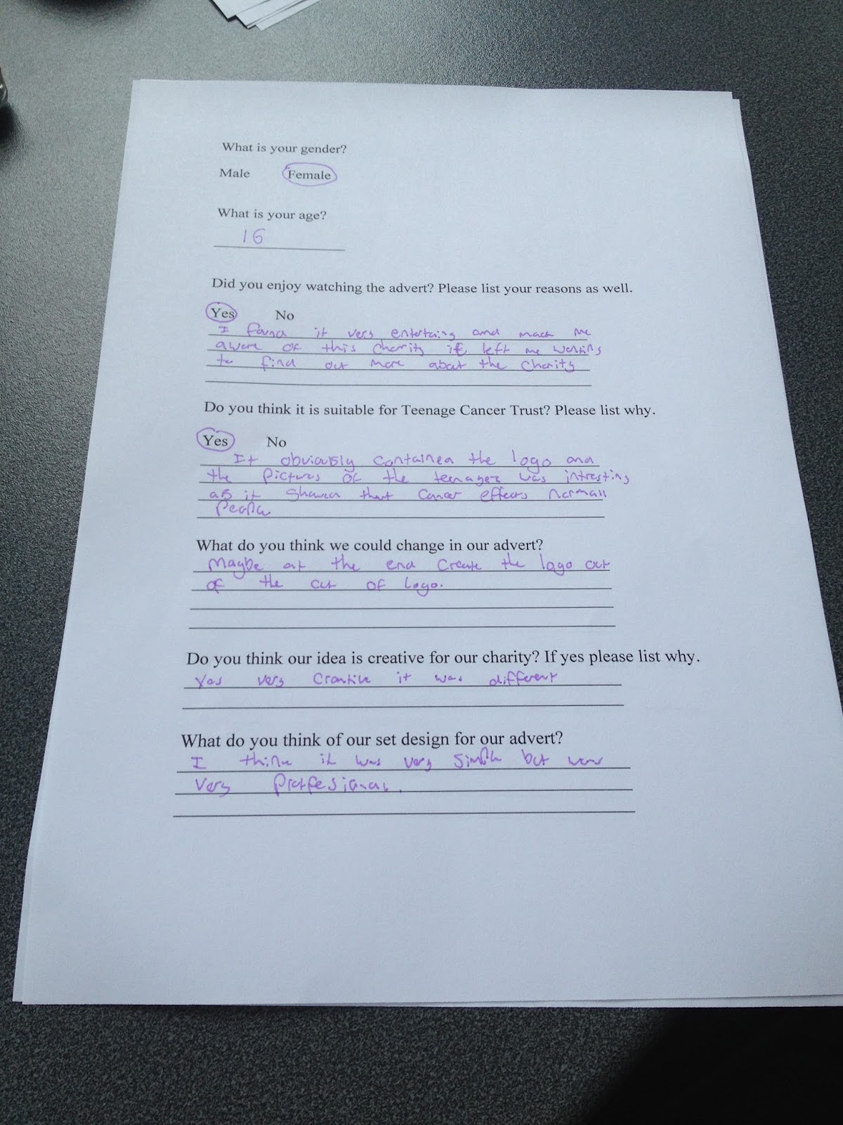
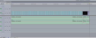
When beginning our editing stage of our animation we firstly begun by discussing what we wanted to edit in our animation and how this would affect our advert. We started off by importing the folder from the desktop which contained all our images which we had taken of the animation.

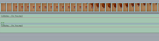
Once the folder had imported we then had to drag all  of the 200 photos onto our timeline. We simply did this by selecting all the photos and dragging them to the timeline, we just had to check to make sure all the photos
were in order. We then had to change the speed of our clips from 00.00.01 to 00.00.05. To make sure
all the clips were the same speed we simply selected
all the clips and changed the speed.

Once all the clips were changed correctly we then added a soundtrack. We all came to the agreement to use 'Fix You' by Coldplay. Once we had
uploaded the soundtrack to our timeline we simply had to cut it to the length of our animation
which was 30 seconds.

The final part of our editing was adding credits/text in to our final clip. We chose to add text just to show who the animation had been produced and edited by, this text consisted of saying ' By Ryan O'shea, Kristie Bird and Megan Harcombe.'

I feel that overall our editing of animation has been completed to a high professional standard, meaning that our sound and clips have been cut accurately and our animation flows very smoothly.


Charity research

TEENAGE CANCER TRUST.


We were inspired by some of the videos we saw on the Teenage Cancer Trust website. These were created by people who have been effected by cancer over the years.


Teenage Cancer Trust's target audience mainly applies towards teenagers. Its a large charity which set up events throughout the year to raise money for the charity, this money then goes on to be put into finding research about a cure for cancer. Although the trust is based around teenagers I also feel that this  can relate to any age


Paper edit


Tuesday 18 June 2013

Evaluative commentary

Our first ideas were just to film James working out in the gym and speaking about his illness and how it effected his life and career, however we found that the idea wasn't strong enough and wouldn't interest our audience enough. We then found out that James was taking party in a charity workout event for 'Save the Children' foundation, this gave myself and Ryan the idea to film a pre talk with James before him taking out in the workout and then an after talk. We also included shots of James and other people taking part in the workout, this made our documentary seem more interesting and entertaining.
We used two cameras to film our documentary to make it more interesting for our viewers so that we could change from one angle to another, we also added in short clips of James working out to our documentary to make it more entertaining as well as just listening to James answer our questions which we had prepared for him and talking about his life. We also thought it would be a good idea to add an interview into our documentary, we interviewed Camilla from 'Save the Children' this would give our audience a more detailed description of what the charity is about and what the money James has raised for them is going towards. We also added titles to this part of our documentary explaining how much money they need to be able to buy certain things. To conclude my final production overall i am very pleased with our documentary. A long the way i have learnt how to fully use final cut and add short clips as well as titles throughout my documentary. I also so how to add in a voice over over the top of some of my previously filmed footage. I also learnt a lot about the charity itself and how James has helped.

Friday 14 June 2013

Legal and Ethical Issues

Slander: When a person has made a statement that is untrue and could/has harm/ed another persons reputation.

Libel: Where a person has published a work that is false causing harm to another person or their reputation.


Slanderous examples:


Living with Michael Jackson'  presented by Martin Bashir, it is unethical because Michael Jackson had agreed to an eight-month long interviewing process with Martin Bashir, hoping to educate his fans about many mistaken assumptions his life. When Michael Jackson saw the finished product of "Living With Michael Jackson" on the air, he realized that Martin Bashir had betrayed his trust in order to produce a obscene thriller that just made more puzzling questions for Michael Jackson instead of him answering his questions for the public. The real dispute hung around a young 13-year old boy who Bashir interviewed without his mothers acknowledgement and within this interview Bashir asked irrelevant questions that made Michael Jackson look perverted, for example: Bashir asked, if Gavin Arvizo (13-year old boy) had ever slept in Michael Jackson's bedroom. 


Another example of a documentry that has been accused of being slanderous is "fahrenheit 911". Michael moore created another controversial documentary. this documentary was accused on many occasions of being slanderous by a variety of people that described that what he was saying and displayed on the documentary made george bush look like he was part of the 911, he went to evade iraq because he wanted to win power to all the oil that country has. in the documentary he portrays george bush to be a liar and a fake person. he basically criticizes everythng that george has ever said and basically calls him a liar. so in a way Michael moore has portrayed to the public a different view on george bush and Michael caused allot of controversy just because of this documentary, allot of people 
started to look at george bush in a different way.


Ethics are a very important and serious thing when it comes to documenting, ethnics is an arrangement of morals within different cultures, and within a documentary they have to respect these different cultures and morals, or the documentary would be classed as unethically correct.

Ethical examples:


For example, the Jimmy Saville case of him being an alleged Pedophile, this is unethical because the makers of the documentary didn't take into consideration that his family and his victims would be dramatically affected by it, because Jimmy Saville is dead now and all the attention and focus goes onto his family and victims. This is unethical, the producers of the documentary done it all for an affect and didn't look forward foreseeing the potential damage it could cause thats why its is unethical. 

Another documentary that is potentially unethical is "Cry wolf". This documentary explores and investigates the controversial decision that the Alberta's government have ignored. they have ignored the threat that the rapid industrial expansion is the alberta tar sands region has caused on its surrounds environment and communities. instead of resolving the problem the government insisted on killing thousands of innocent wolves, they did this so that in the public eye they appear to be doing something to save the dwindling woodland population and wildlife. the interviews with the "experts" in the documentary  prove the myth of Canada's "ethnical oil" is further exposed as oil industry greenwashing. to me this documentary is very unethical as they are under-minding the public telling them lies and trying to prove they are "apparently" doing something to protect the surround environment, where as they are actually doing nothing at all just killing the innocent wildlife that is still living there, it is argued that they have done this to hide the fact that this oil industry is causing a number of problems with local communities and the harm it is doing to the wildlife that lives around this industry.

shooting script


Thursday 13 June 2013

mise en scene

Mise-en-scene
The mise-en-scene in our interview consisted of being in a small box room located in the Virgin active gym which included a red sofa in which James sat, for the interview the use of the red sofa related back to symbolise the Virgin logo. Surrounding the room was cupboards and a small fridge as this was one of the small staff rooms at the gym, in the background there is a small kitchen area including, a cheap looking bin and a microwave on top of a small worktop.
Behind James on the wall were painted hand prints of all the staff who have currently or still worked at Virgin Active gym. I don't feel that the paintwork looked as professional, however we didn't really have much choice as our original location which we chose was being used for personal training class.

As the location and the surroundings of James throughout our interview were very informal, i felt that this made our interview with James very relaxed and a very informal interview rather than if we were in an office room filming this is because James is sat on a sofa which would be very comfortable for him and would help him to relax a lot more, also because we are filming in James's environment it also gave him an opportunity to completely be himself rather than putting on a bit of an act in front of the camera . I felt that it was more of a casual conversation rather than a formal interview with James.

The lighting we used was very minimalistic and was just used from the celling lights already in the room. This was very useful as we did not have to add any extra lighting to our interview.